(November, 2002, ff)
A while ago, Ivor Lewis asked substantially that question on Clayart. I responded offline, telling him that I could show him at least something by presenting comparative photos, and he asked me to do so. I figured that there might be other people who were interested, so I have built this page.
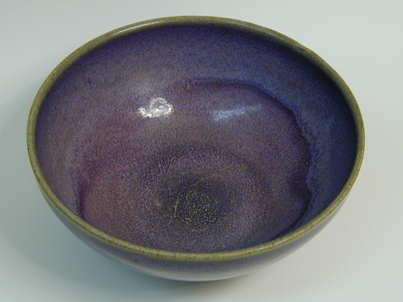
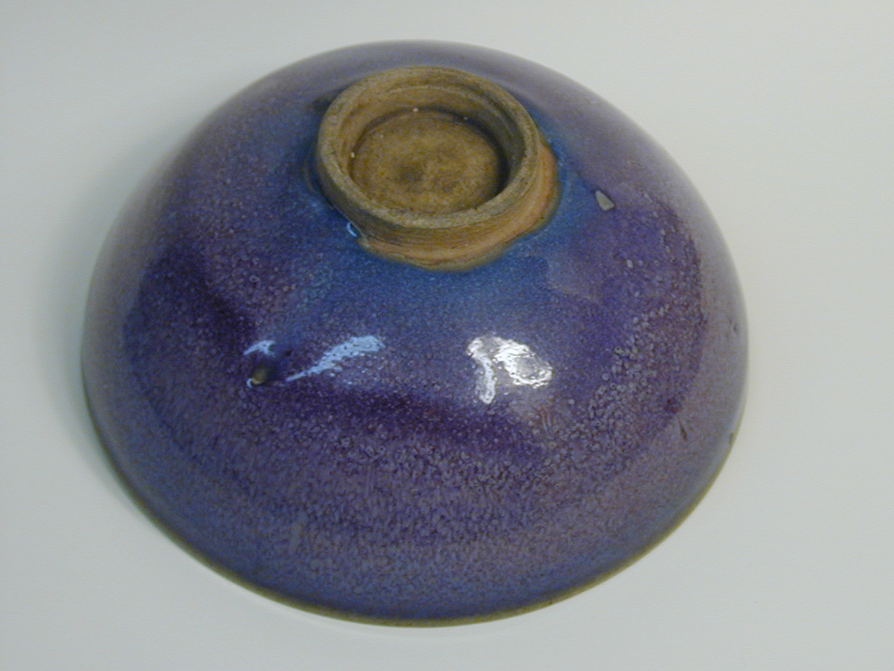
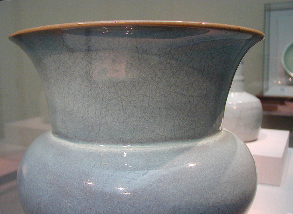
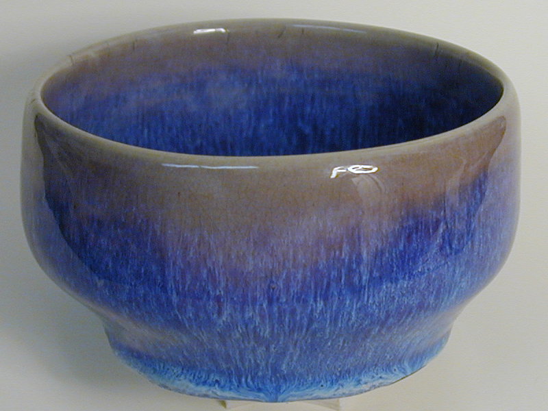
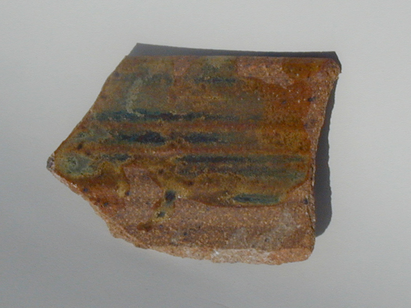
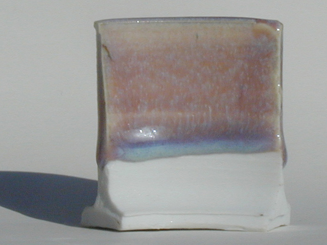
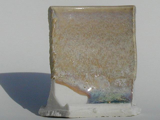
I only have one Jun Yao piece, a bowl I bought in China. I have no least notion whether it’s ancient or modern, but it was represented to me as being old when I bought it, and I don’t have any particular reason to think that it isn’t. It’s not very fancy, and it’s a bit more purple than most Jun ware; but it’s what I’ve got, and it is certainly well within the “normal” range of colors for classic Jun Yao. (Jun Yao varies widely in color, from “moon white” and pale blue-white through grays and grayish blues, and on into rich orchids and purples.)
In addition I’ve got photos here of two fine pieces that are currently on display at the Freer Gallery of the Smithsonian Institution, in Washington, DC. If you want more photos, Nigel Wood has several on pages 118 to 125 of Chinese Glazes, and an excellent orchid/purple flowerpot on page 166. There are, or course, various images on the Web, but I haven’t found very many really good ones.
Here’s my bowl:
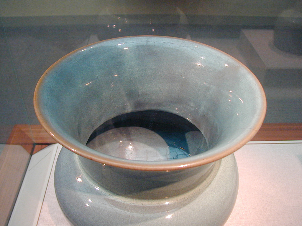
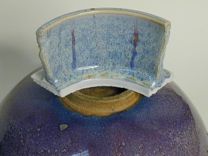
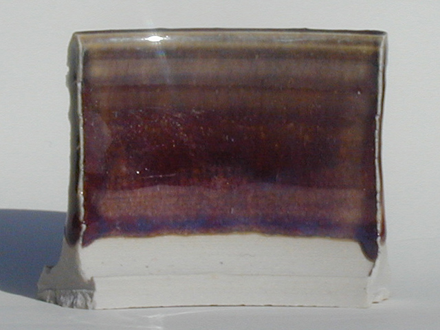
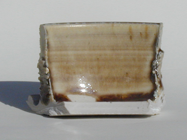
Here are the pieces from the Freer Gallery. First, a bowl with an inscription.
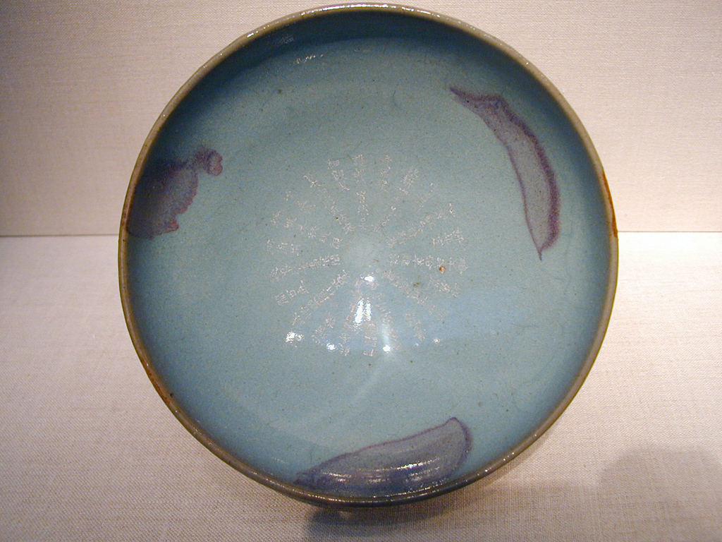
You can see the copper-purple splashes that are often found on Jun wares.
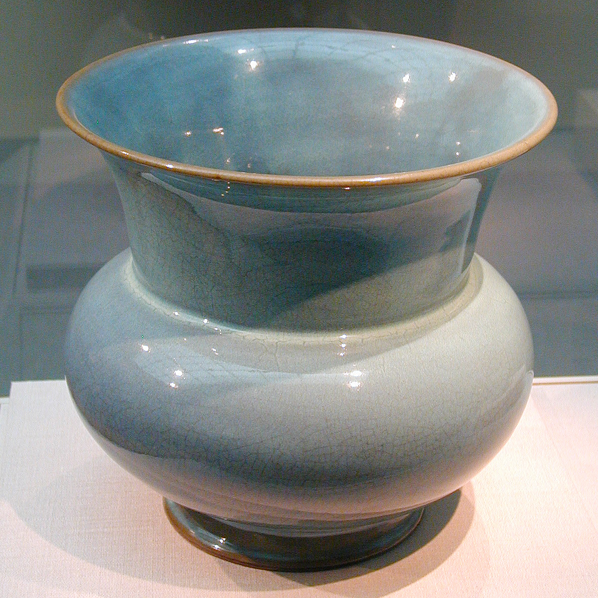
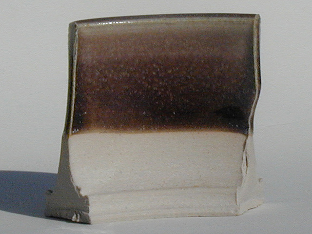
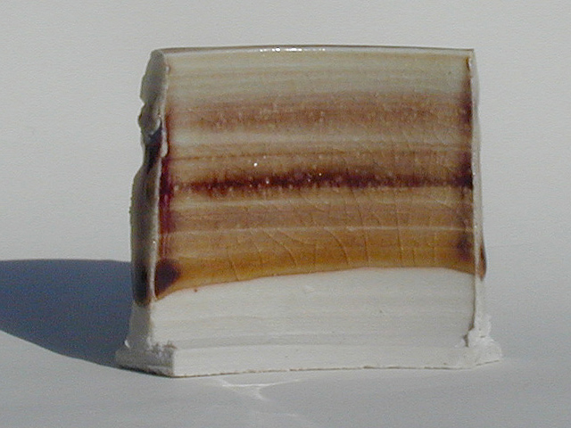
Next, a large vessel of a good blue-gray color. I have three views here, all in available light, a couple of which clearly show the “earthworm-tracks” or &ldquolflies’-legs” patterns of dark lines, which appear to be caused by cracks that formed in the glaze as it dried after the pieces were dipped in it. It is possible that some carbon-trapping occurred before the cracks closed up during firing, or perhaps there’s some extra flux from solubles that evaporated to the newly-formed surfaces, or maybe the surface (including the crack surface) melted first and thus has different flux content from the interior... I don’t really know. In any case, the glaze does not really seem to be crazed, but on casual inspection it sure looks like it.
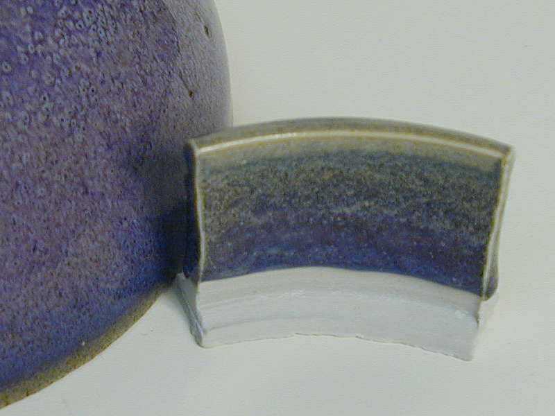
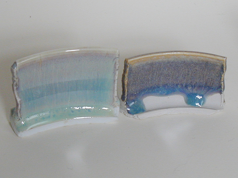
I can’t go yanking things out of the Freer, so I’m obliged to use my own piece for direct comparisons. (I may put up some indirect comparisons, where I show part of an image from the Freer next to another image of one of my glaze tests, but you’ll have to pretend to trust the white balance on the camera as far as color is concerned, and there isn’t really any good way to determine relative scale.) Anyway, here’s my bowl again, with test tiles of three reasonably representative Rutile Blue glazes.
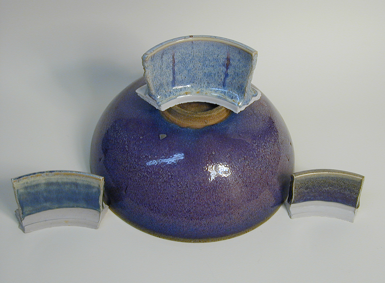
While it’s clear that none of my comparison pieces is an exact match, there are distinct similarities in each of them. For example, some of the colors in the one on the lower right are almost identical to the majority color of the bowl. (My guess is that the glaze on the bowl has more copper in it, which contributes to its purpleness.)
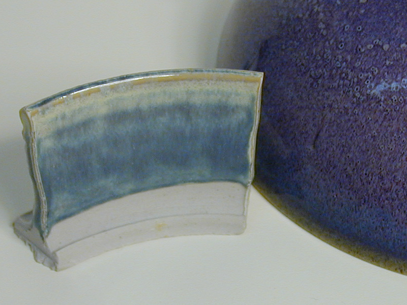
Here are closeups of the three tiles. My apologies for the fuzziness of the third tile, the one with the dark purply color; I’ll try to redo the photo as soon as I can.
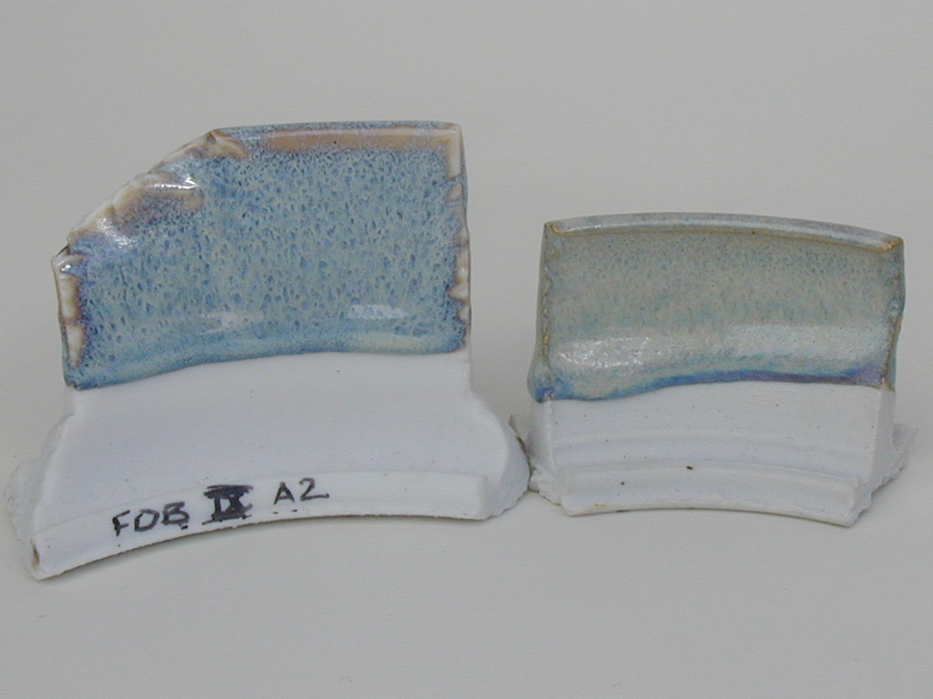
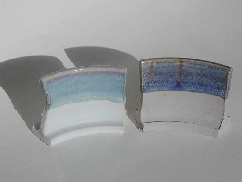
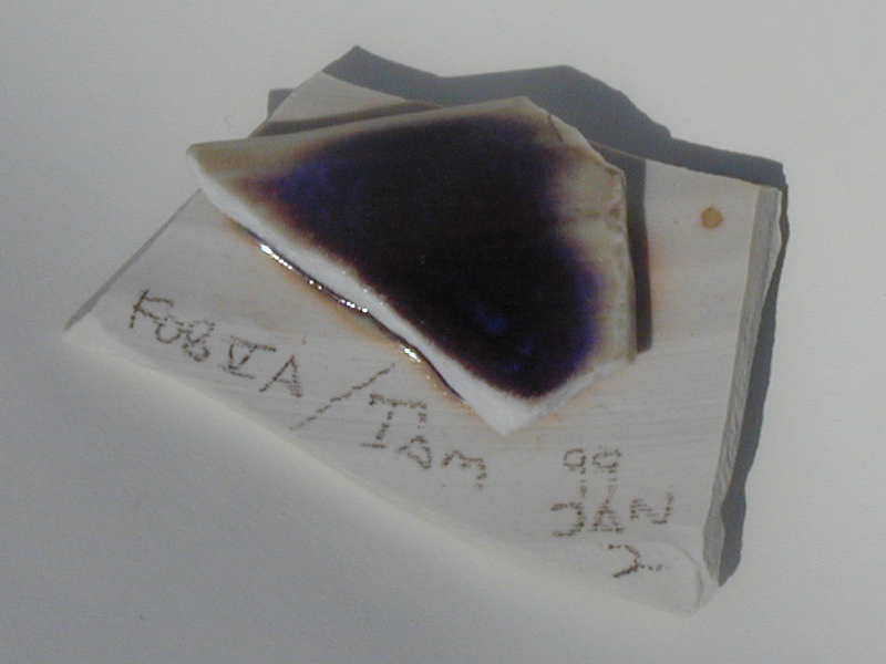
Here are a couple more photos. One of the tiles (the one all the way on the right) is the one at the left of my bowl, above; these were taken in reflected sunlight, and they show slightly different colors. The tile on the right in the first photo is actually vaguely similar to some of the "moon white" juns that I’ve seen, except for the blue at the base of the glaze, where it has run and thickened. I include these as more evidence of the range of variability of these glazes; I could also show some that are neither blue nor creamy, and perhaps I should, though I generally think of them as failures. You can guess, from the inscription on the leftmost tile, that I’ve been through a few of these. (It was version A2 from series 9; I am now up to series 16 and still trying.)
In sum, I think it’s safe to say that while Rutile Blue
glazes don’t really look exactly like real Jun ware, they
can, on occasion, get surprisingly close. The other
advantage of Rutile Blue glazes is that it is actually
possible to make them. (See the technical appendix for
more about this.)
In Ceramic Masterpieces, Drs. W. David Kingery and
Pamela B. Vandiver provide a thorough examination of Jun
glazes, replete with triaxials and photomicrographs, even
photographs taken with a Scanning Electron Microscope. (If you
are technically minded and you care about pottery, you need
to read this book.) I am not about to write an entire
chapter here, so I will summarize as well as I can. Any
errors are, obviously, mine.
There are at least four obvious sources of color in
typical Jun Yao. First, pieces are often splashed with
copper, and some pieces have glazes that are mixed
with copper throughout. These are more or less purple.
Second, there are little blue-white streaks and clouds,
which are readily visible under the microscope. These
are apparently Wollastonite crystals.
Third, there is iron in the glaze, which is reduced, so
they have some of the same blueness or blue-greenness as
celadons. (In fact, the compositions of Jun glazes are very
close to the compositions of celadons.)
Fourth, and most importantly, there is opalescence caused by
a liquid-liquid phase separation in the molten glaze. This
makes firing Juns extremely tricky, as the students of
Drs. Kingery & Vandiver found out when they set out to
replicate these glazes. In their book, they flatly state
that of all the glazes they and their students replicated in
their lab at MIT, the Jun glazes were far and away the most
difficult. The phase separation depends on a number of
factors, and seems to take place only at temperatures below
1200 celsius. Because the glaze is viscous, it is a slow
process -- kilns in China that are similar to the ones that
were used for Jun Yao are heated for three days and cooled
for seven.
(Note: People used to think that Phosphorus was necessary
for the formation of opalescence, but it turns out that Jun
glazes do not contain enough Phosphorus to cause milkiness.
Moreover, Jun glazes apparently have about the same amounts
of Phosphorus as various other ancient Chinese glazes that
aren’t opalescent. Iron, however, does seem to be
necessary in Jun formulations.)
It is easy to detect opalescence if you have a shard: an
opalescent glaze typically appears blue if you look
at it, and yellow or brown or reddish if you look
through it. That is, the glaze is not colored
blue in the ordinary sense. (Compare this with a clear glaze
or glass that contains Cobalt, for example -- if you look at
it, it’s blue. If you look through it, it’s blue.)
At least some Rutile Blues are opalescent; but that doesn’t
seem to be universal. (If my understanding is correct, only
misfired Jun Yao lacks opalescence entirely. If it is
cooled too rapidly, a Jun glaze is clear and bubbly; if
cooled too slowly or kept hot too long, it is opaque.)
On the other hand, many Rutile Blues have little clouds and
streaks in them that are quite similar to the ones in Jun
glazes. On the other hand, I think that it’s possible to
make a Rutile Blue with very little CaO content; and such a
glaze would probably lack these features if they are
Wollastonite, as I suspect they are.
I seem to recall, from reading about this, that a lot of the
blue color in Rutile Blues is caused by the same Fe-Ti redox
coupling that is responsible for the blue color in
sapphires. I may be misremembering that, though, so take it
with a grain or three of salt. Also, I’ve found that the
color of my own glazes is extremely variable, and I
have suspected for quite some time that there are several
major sources of coloration. (I have definitely seen
opalescence in some of my tests.)
I can’t speak to other people’s Rutile
Blues, but mine frequently contain a little bit of Cu,
which accounts for the purple that you see in a lot of
my tests. This, again, is similar to what you see in a
lot of Jun Yao.
I should note, btw, that modern “Jun” or
“Jun Yao” ware seems typically to be a
slightly opalescent or flambé copper red, and is
considerably different from the ancient stuff. My
concern here is with the ancient ware. I should also
note that I have seen several glaze recipes that claimed
to be “Chun” or “Chün”, but
they didn’t really seem to have anything to do
with Jun Yao, either in their composition or their
appearance, and I’m at something of a loss as to
what the term “Chun” is supposed to mean in
modern pottery. (The spelling “Chün”
was an earlier [Wade-Giles] romanization of the Chinese
word that is rendered as “Jun” in the modern
[Pinyin] romanization. I think, btw, that the umlaut
should have been retained: whenever I heard people in
China pronounce the word, it sounded that way.)
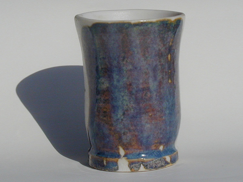
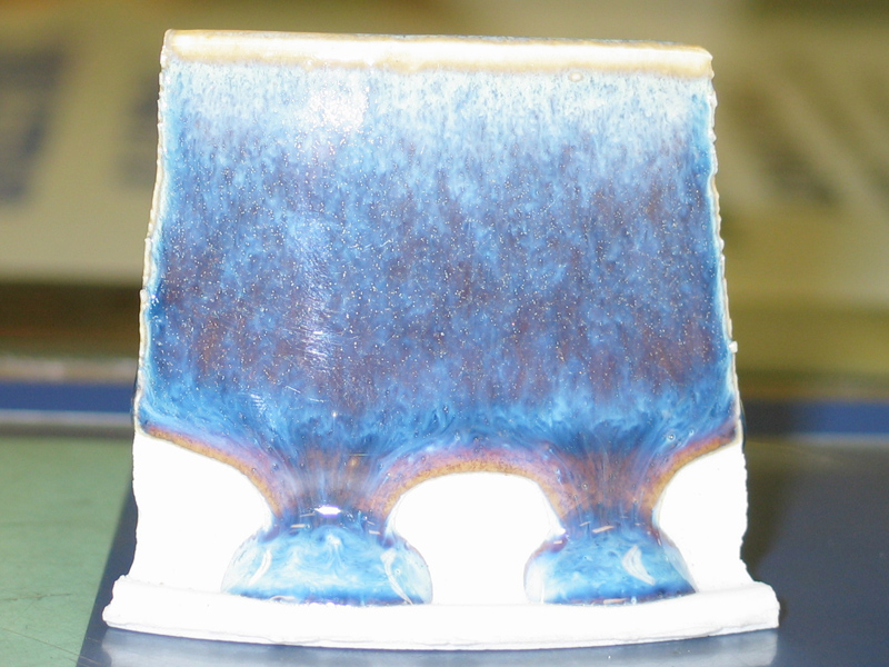
The first glaze that really captured me, when I was very new
at potting (my second or third day, in fact), was a Rutile
Blue. Here’s a bowl that I made when I’d been at it for a
few months, covered with that glaze:
The glaze is
Larry Bruning’s
“Opal Blue”, and I believe I can safely tell
you that Larry developed it specifically in imitation of
the ancient Jun glazes. It has the usual faults of
Rutile Blues, and it doesn’t really resemble Jun
very closely, but I still love it. Speaking of faults,
you will notice that the rim of the bowl is rather bland
(except for where the @$#$#@ squirrels chewed it while
it was drying, and I was obliged to make repairs), and
that the glaze has run right off the foot in several
places. I was obliged to grind off the drips, and
I’ve actually lost some pieces when the glaze ran
and they stuck to the pedestals on which I fired
them. You Have Been Warned. (They’re much less
likely to drip if you spray the glaze on and keep it
thin near the base; but do be careful about safety when
you spray!)
Larry is a production potter. He develops his own
glazes, and he is understandably somewhat proprietary
about his formulations. Back in 1996, however, he was
kind enough to let me examine the recipe for Opal
Blue. I proceeded to tweak it and play with it, trying
to find a good rutile blue of my own. Since then I have
been through a great many glaze tests and
reformulations, trying to come to some sort of
systematic understanding of what makes these glazes
tick. One of the things I’ve discovered is that
there isn’t any one Archetypal Rutile Blue Glaze
for me; I like a great many of the effects and colors
that I’ve gotten. Another thing I’ve found
is that they are complex, and have lots of variables
that you may need to be aware of. For example, if you
are thinking about making some of these glazes
it’s important to remember that they are insanely
sensitive to the body they’re on and the firing
conditions. Here are some examples:
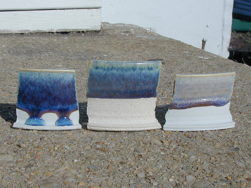
Both of the tiles in each photo were dipped into the same
glaze. As far as I can recall, the two tiles were then fired
together in the kiln. The tile on the left in each photo is
one of my translucent porcelains, and the tile on the right
is a regular commercial throwing porcelain. (I haven’t tried
most of my glazes on stoneware, and have only a dark
suspicion that they wouldn’t look very good. Larry Bruning’s
"Opal Blue", on the other hand, is just fine on stoneware.)
Here are more examples. This is a glaze I discuss below; the
dark blue tile and the relatively pale tile are P-60S
porcelain, from Mile Hi Ceramics, in Denver. The stoneware
tile is probably Granite or a mixture of Granite and "Slop
Barrel". (Sorry, I don’t know who makes Granite. If I find
out, I’ll put the information here. My first guess is Laguna,
but take it with a grain or two of salt.)
The stoneware tile and the rather pale tile were in the
same firing at Glen Echo Park, and went to about cone 11.
The dark blue P-60 tile went to cone 10.5 or 11 in Edwin
Gould’s kiln, in Columbia, MD. The big difference is that
Ed starts reducing very low, probably around cone 018,
whereas Jeff Kirk, my instructor at Glen Echo Park, doesn’t
begin to reduce until cone 08.
I continue to work on Rutile Blues, because I’m kinda nuts
over them and because I’m still a student and have sold very
few pieces, so I haven’t gotten to hating everything blue
yet. Also because I’m an idiot, and I don’t know when to
give up. Recently I went back and looked over a large number
of glaze tests, and decided to modify this one, in order to
reduce the thermal expansion and tweak things a wee bit on
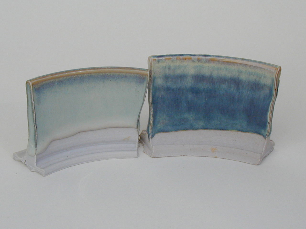
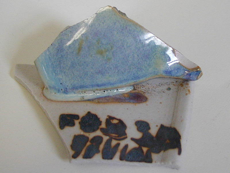
general principles. The first test I got back was the rich
blue tile, above. Here’s a view of the original that I was
working from::
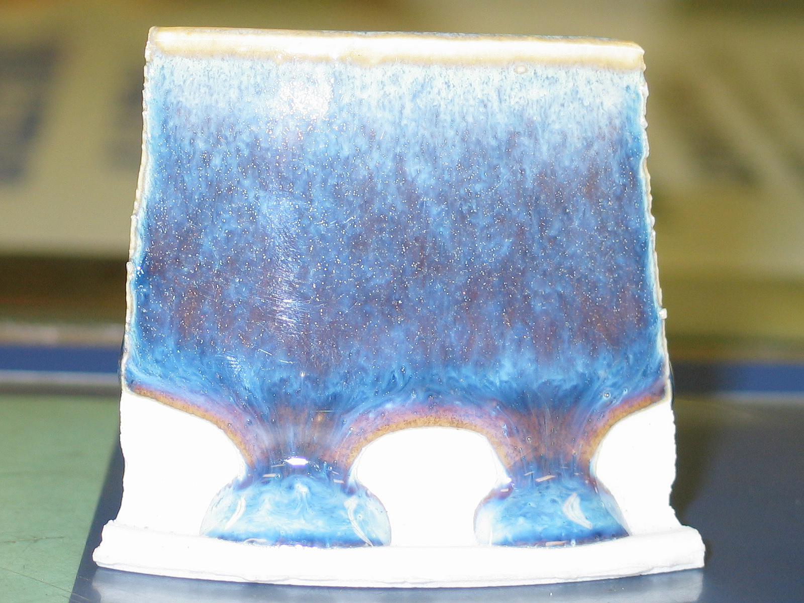
As you can see from the rude inscription, this is version 3A
("FOB" = "Fake Opal Blue", a fake of a fake. Such is life,
eh?), and I made it quite some time ago. I really love the
colors and the general sense of liveliness that this tile
has, which is why I went back to it. Just by the bye, my
current inscriptions are on the undersides of the tiles, and
are considerably more complete -- I usually indicate the
material, the glaze, the date on which I mixed the glaze
or dipped the tile, and the kiln in which I expect to have
the tile fired. (I don’t have a high-fire gas kiln of my
own yet, and have been getting things fired by other folks.)
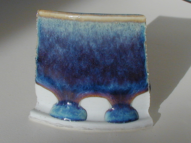
I went through several iterations of "version 3*" before I
mixed one, C3, and dipped a test tile. Here’s another view
of it:
I really like the way this glaze seems to have bright clouds
dissolving into a dark sky as they fall down the side of the
tile. I’m going to put it on some actual pieces, and see
what it does; my current guess is that it’s a keeper.
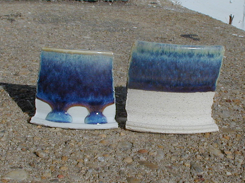
On the other hand, if I want to fire it at Glen Echo Park,
I may be restricted to putting it on stoneware. Even so,
it is a bit watery. Here are the two tiles again:
I don’t exactly mind the way it looks on the
stoneware tile, but it doesn’t seem to have the depth that
it has on the original P-60. On the other hand, at least it
didn’t drip. I’ll have to fire some actual pots in both
kilns, to see what turns out to be viable.
Here are some results I’ve had along the way that were
either "different" or outright failures. First, something
that’s pleasant: I mixed a test with Titanium Dioxide
instead of Rutile. (Note: some of the texture here comes
from the fact that I applied the glaze with my fingers,
rather than dipping the piece into it.)
I rather like that, and in fact I fingerpainted a vase
with it. Worked pretty well.
Here’s what happened when I put one of my glazes onto
a piece of stoneware:
There may be some uses for this, but it certainly wasn’t
what I was looking for at the time. The result I show above,
from Glen Echo Park, is a lot closer to what I want. It
seems reasonable that "white" stonewares would change the
glaze less than "toasty" ones...
Here are examples of what you get if you don’t put
enough Rutile into the glaze. (The middle one is
even worse. I have no idea what went wrong, but it
is thoroughly gray and largely lifeless.)
The following seem more or less bland and lacking
in interest to me, though I have friends who like
the first one quite well:
Here’s what happens if you underfire one of these. (Actually,
I’m not really sure quite what happened with the tile
on the right, though if you look at it carefully you’ll see
that I accidentally broke it and was obliged to glue it back
together.)
I’ve had a ton of fun (along with a certain amount of
annoyance and despair) with these glazes since I started
playing with them, back in 1996. I hope that if you decide
to mess with them you have more of the fun and less of the
garbage, though I must admit that some of the garbage has
been extremely instructive, and I’m much better off for
having slogged through it.
I’ve been thinking about getting a better camera than the
one I took these photos with. This evening (19 or 20
November, 2002), I went to the camera store and used a Canon
G3 to take one shot of the test tile I got back on the 16th
of this month. Please bear in mind the following:
1. I don’t know how to use the camera. I pretended
that it was a point-and-shoot, though I did zoom in
on the tile a bit.
2. The lighting in the store is ordinary fluorescents
in the ceiling. (The camera used its internal flash.)
3. I have my regular camera set for minimal compression,
which gives me good picture quality. The Canon was
apparently set for fairly mediocre quality.
Here are three shots (I’m repeating the one above,
for simplicity). First, the tile in sunlight, taken
with my regular camera, an Olympus Camedia C-2000z.
Second, the photo from the Canon. Third, the photo
from the Canon again, but I’ve run an "unsharp mask"
filter on the image in Photoshop. I try not to get
too enthusiastic with this filter, so the difference
may be difficult to see here; on some shots it’s
more apparent.
For even larger versions of the Canon photos, try:
1600 x 1200 px or
1600 x 1200 px, unsharp mask filter applied
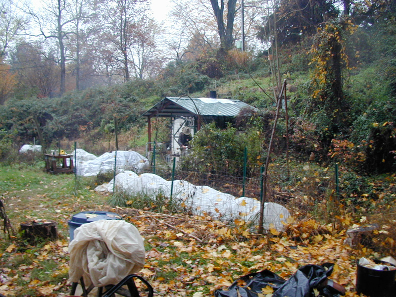
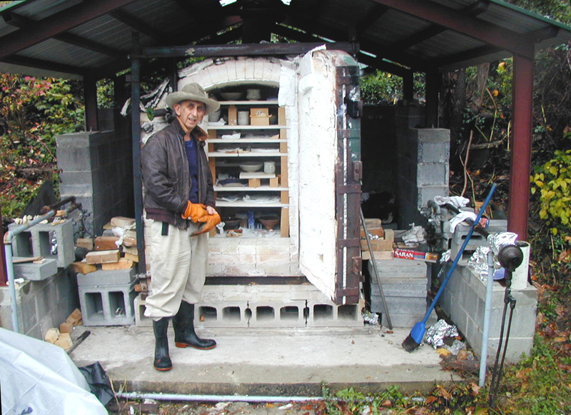
Here are Ed Gould and his kiln, if you care about such things:
I’ll try to add a photo of the kiln at Glen Echo Park
when I have a chance; that’s where I take classes, and
a lot of my glaze tests are fired there. Don’t think I
have a photo of the kiln at Bruning Pottery, unfortunately,
and it’s in Seattle, so I don’t think I’ll be able to
get one any time soon.
Pseudo-mail-to: a (at) b (dot) c, where you can replace
“A” with my first name, just 3 letters;
“B” with joss; and “C” with
the usual 3-letter abbreviation for a commercial entity.
Pseudo-phone-to: +1 240 604 4495
Last modified: Thu Oct 4 01:19:34 EDT 2012
Technical Appendix: What’s Going On Inside These Glazes?
What About Rutile Blue?
Postscript: What Is It About Rutile Blues, Anyway?
Along the Path: Some Illustrative (Ahem) Examples
An Off-Topic Aside on Digital Cameras
