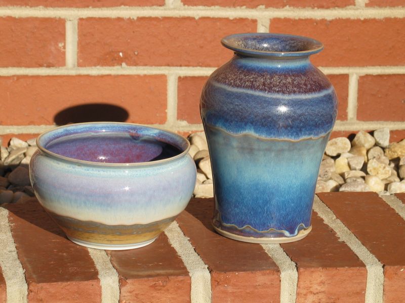


(2004 December 15, outdoor photos taken on the 16th)
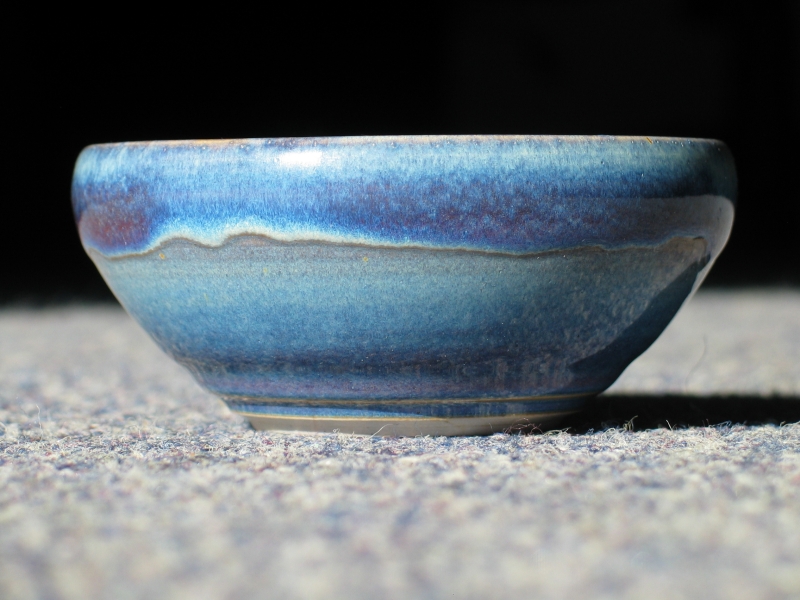
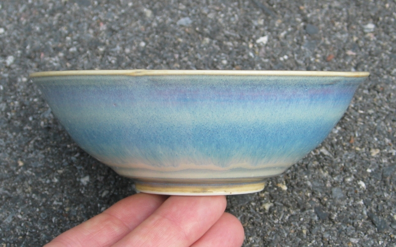
These two objects, a vase and a bowl, have exactly the same glaze on (and in) them. The exteriors were sprayed in quick succession after I poured the interiors, and they were fired in the same kiln at the same time, right next to each other on the shelf. The main difference is the body: the vase is Loafer’s Glory, and the bowl is Helios. (Both bodies are made by Highwater Clays.) The firing went only to cone 9, because I couldn’t see the blasted cones for some reason, and I fired to temperature, which was (of course) inadequate.
(As usual, click any of the small images to get a larger version.)
For those who care: I start reduction around 650 or 700 celsius, and continue until about 1220 (approximately cone 6, basically the point at which the glaze has skinned over and further reduction doesn’t accomplish much). For Copper Reds, I reduce only very lightly; but Rutile Blues seem to want a more aggressive reduction, so I bring the automotive oxygen sensor up to at least 650 or 700 millivolts. When the kiln reaches 1220° c, I reduce the gas flow until the flame is more or less neutral to slightly oxidizing, and I keep it that way until the end of the firing.
Note: If you have a fast connection to the net and you want
more detail, here are the original pixels.
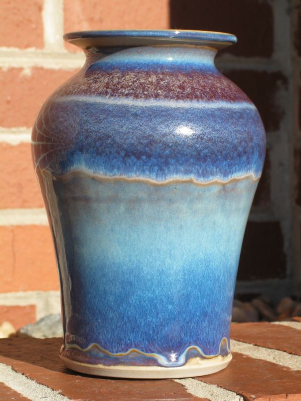
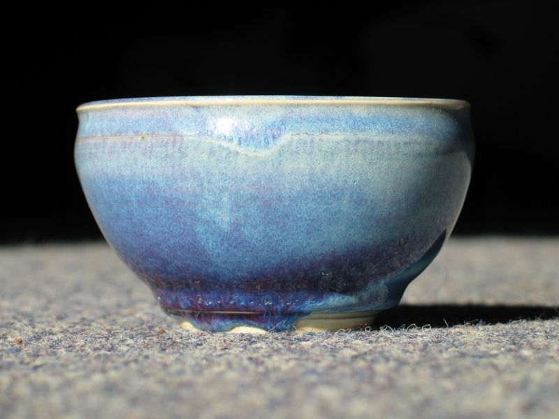
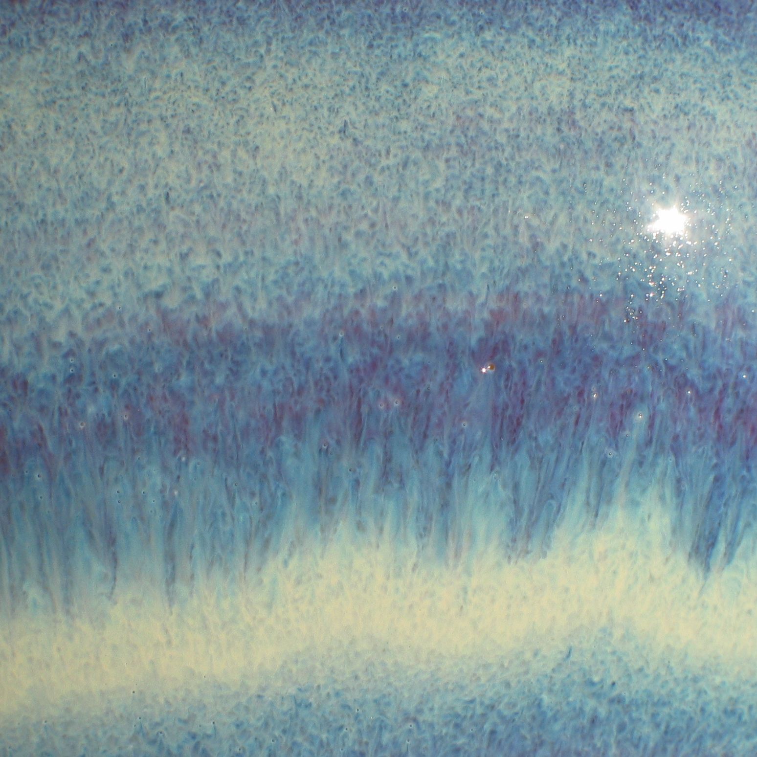
Vase, overall view.
(February 2, 2005)
I have, at least for the moment, settled on a formulation that
is intermediate between the "no added iron or copper" and "0.5%
RIO, 0.3% RCO" extremes. Because it has some Fe and Cu in it, this
version of the glaze makes reasonably rich colors on porcelain.
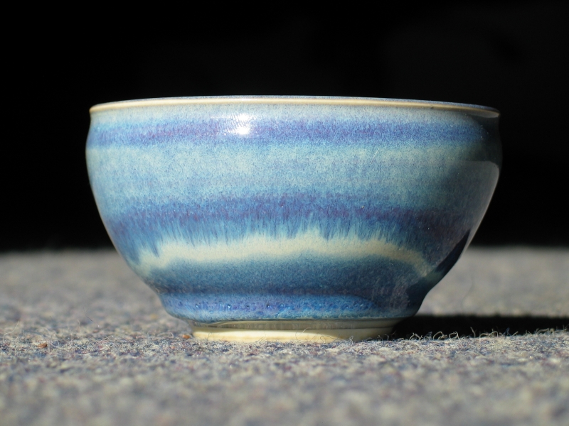
Here’s a Helios teabowl I fired to cone 9 in moderate reduction
on February 1st:
As before, the interior is poured and the exterior is sprayed. I
like spraying, at least for the outside, as it gives me a bit more
control and lets me get some effects that are not easily created
by dipping.
As usual, you can click any of the small images to get a larger one
(800 x 600 px). If you are a real glutton for punishment, you can
view any of the 800x600 images above and change the filename so that
"8c" becomes "22c". That gets you the original 2272 x 1704 px image.
Alternatively, just click any of the small images below for a
rather large detail closeup. (These are all in excess of
1400 px across.)
(This bowl is in the collection of Lisa Peoples, and the
photos are shown here by permission.)
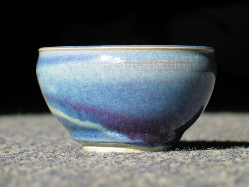
Here is the same glaze on Loafer’s Glory, from the same firing.
You’ll notice that the colors are deeper and tend, perhaps, a bit
more toward the red. Again, if you want large images, click any
of the small ones. If you want the full originals, change "8c"
to "22c" in the filename of the 800x600 image.
(This bowl is in the collection of Fa and Bob Shimbo, and the
photos are shown here by permission.)
(15 February, 2005)
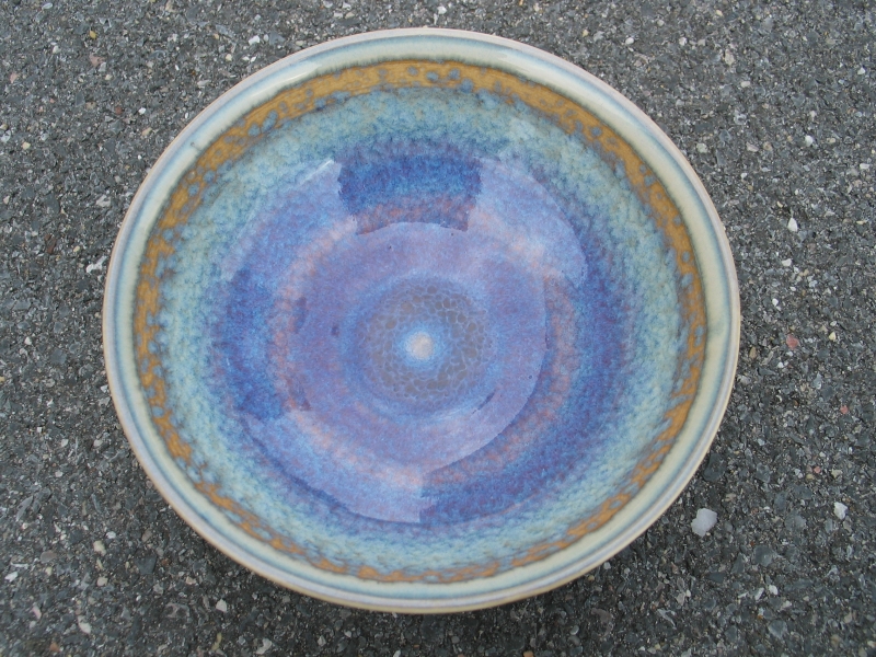
I glazed and fired these two bowls today, taking them to cone 10
in moderate reduction. They illustrate some of the reasons
why I spray my rutile blue glaze...
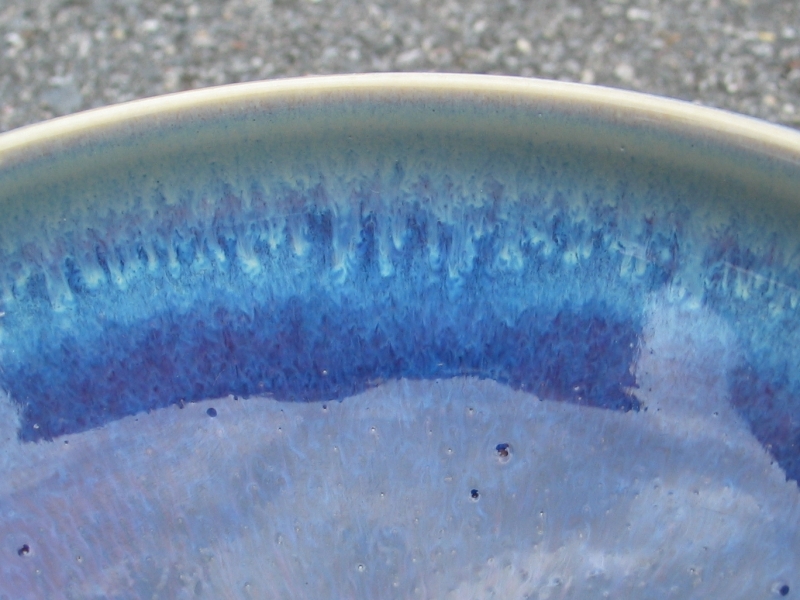
...and also some of the problems with Rutile Blues (note
the pinholes in the glaze) and the variability or
unpredictability involved in spraying. While I like the
gold color just below the rim in the first bowl, it was
not quite what I had in mind. Also, please note the huge
differences in color between the two bowls. These bowls
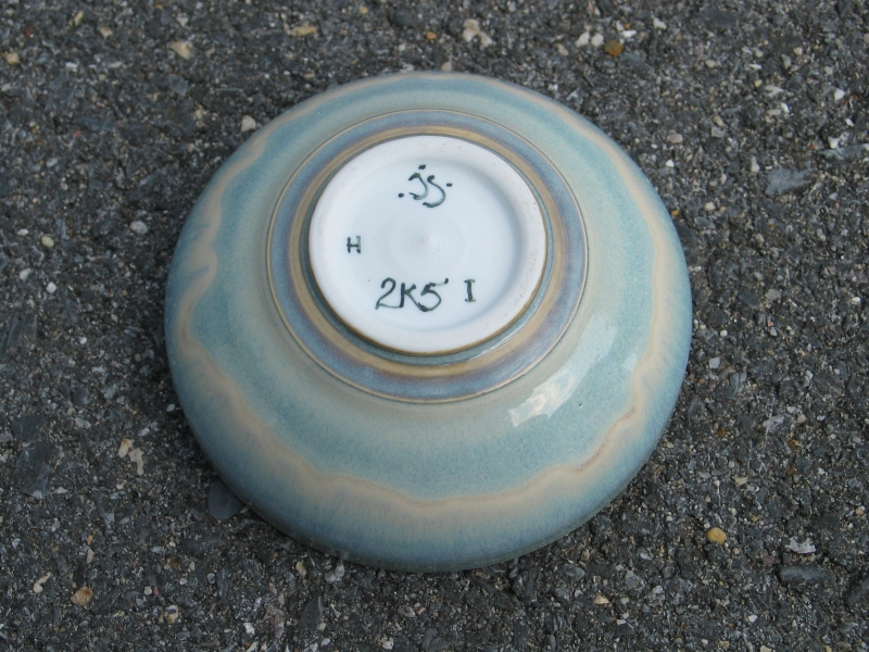
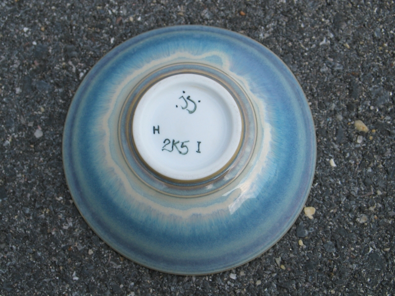
are made of the same material, Helios porcelain (the "H"
on the bottom); they were glazed within minutes of each
other, from the same jar of glaze (in fact, the same jar
that glazed the two bowls from the beginning of February);
and they were fired together. The color differences seem
to be entirely an issue of glaze thickness, while the
visual texture of the lower bowl, as if the glaze had
fallen in little clouds or snowflakes, is an artifact of
the amount of water in the glaze slip and the characteristics
of the sprayer, as far as I can tell.
If you want more pixels, you can change ".8c." to ".22c."
in the regular shots. In the side views and interior
details, in the upper set, 205rc1 goes to 15c and 222c1
goes to 13c; in the lower set, 204c1 and 221c1 go to 16c,
and 223c1 goes to 14c — they’re crops from the original
images.
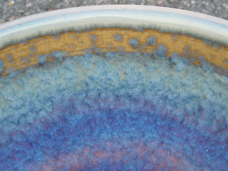
(24 February, 2005)
I glazed and fired two bowls a couple days ago, to cone 10.
both of them showed a certain amount of blond or gold just
below the rim, and it’s clear that the "gold ring" is not
just the gold at the end of the rainbow. Both are mid-blue,
with less color variation than the bowl just above, and
little or no purple, but they are quite pleasant nonetheless.
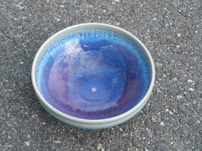
I did a bowl and a vase today, taking them to cone 9 in
moderate reduction. Here’s a quick view of the bowl:
The lightly glazed area below the rim on the interior is
not golden, but it’s reasonably pleasant. The interior
has somewhat richer color than either of the two bowls
I fired the other day. I’m clearly learning how to exert
at least modest control over this, which is a happy thing.
Note that this photo was taken in mediocre roomlight, and
that proper lighting might reveal a bit more color.
email: a@b.com, where a is replaced by my first name
(just jon, only 3 letters, no “h”, and b
is replaced by joss.
My phone number is +1 240 604 4495.
Last modified: Tue May 9 11:35:37 EDT 2017
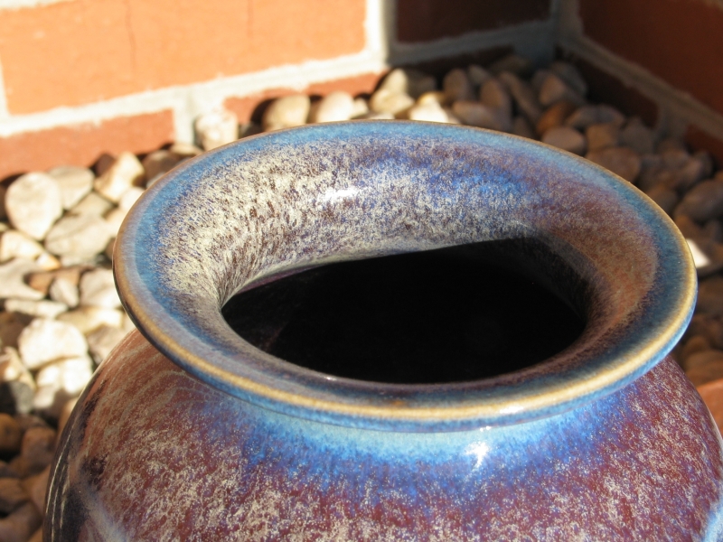
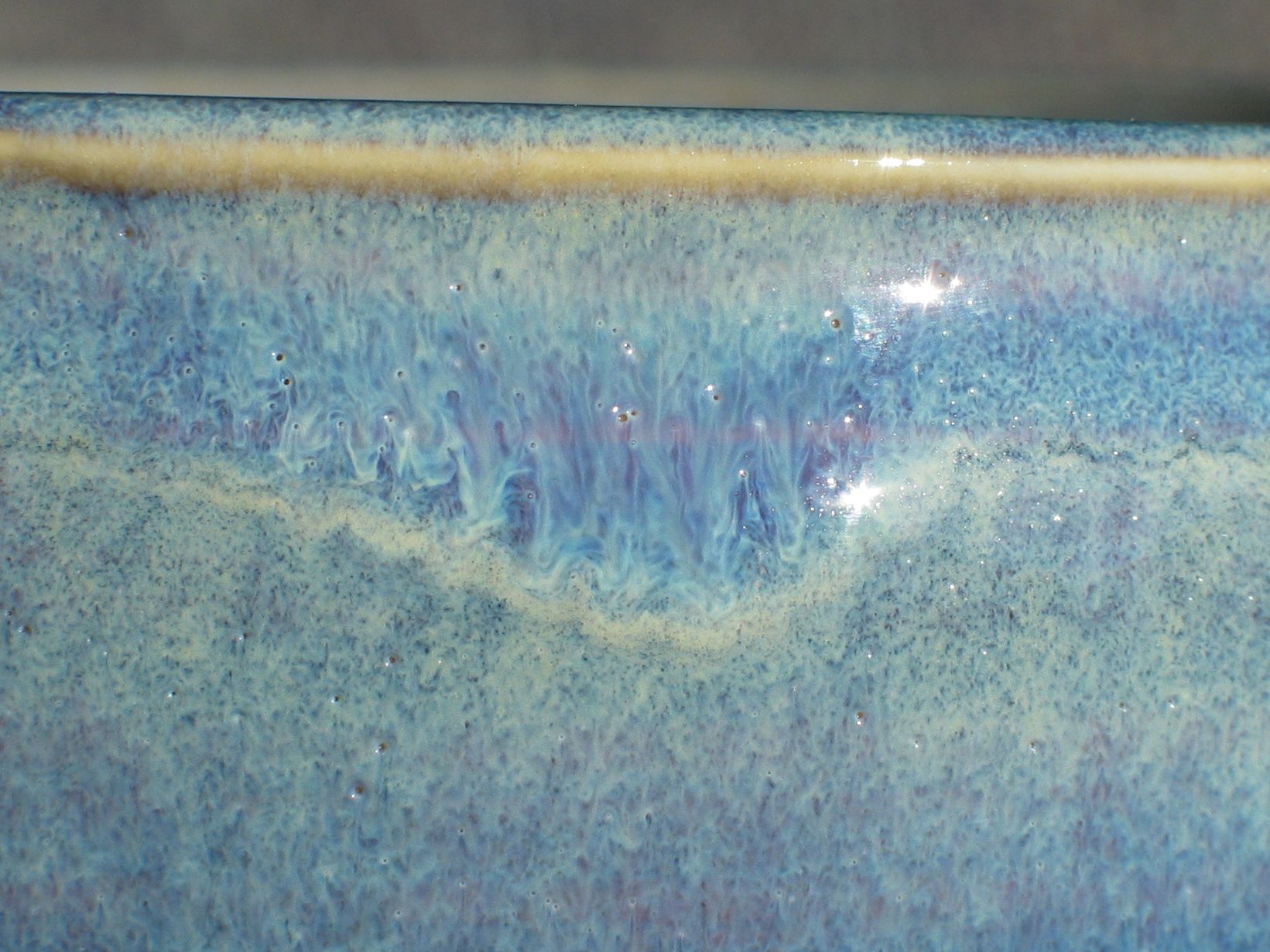
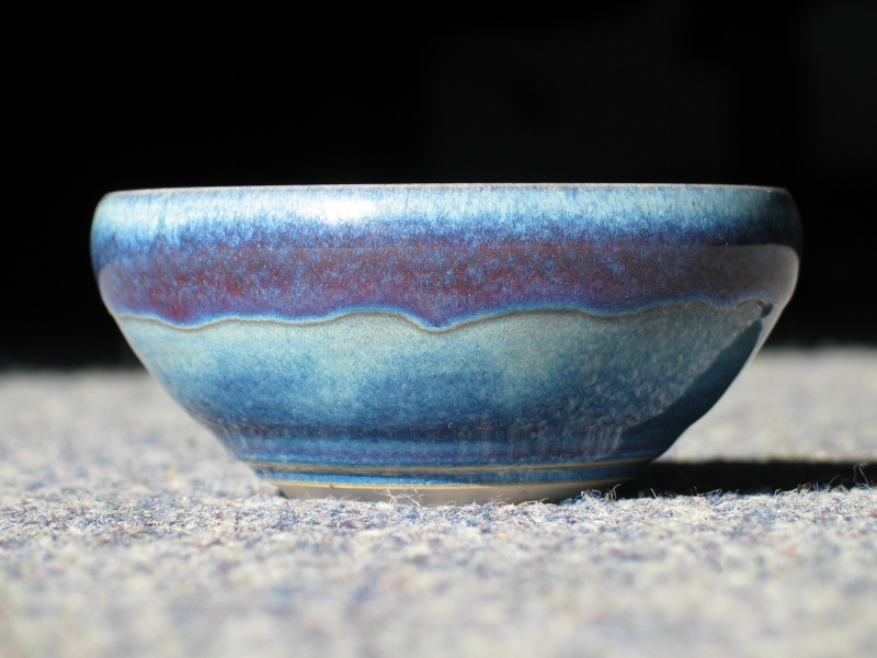
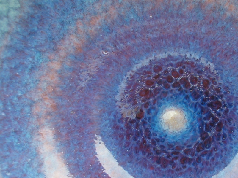
Vase, detail of top.
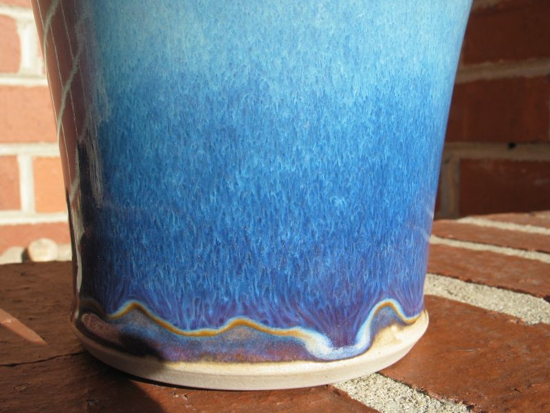
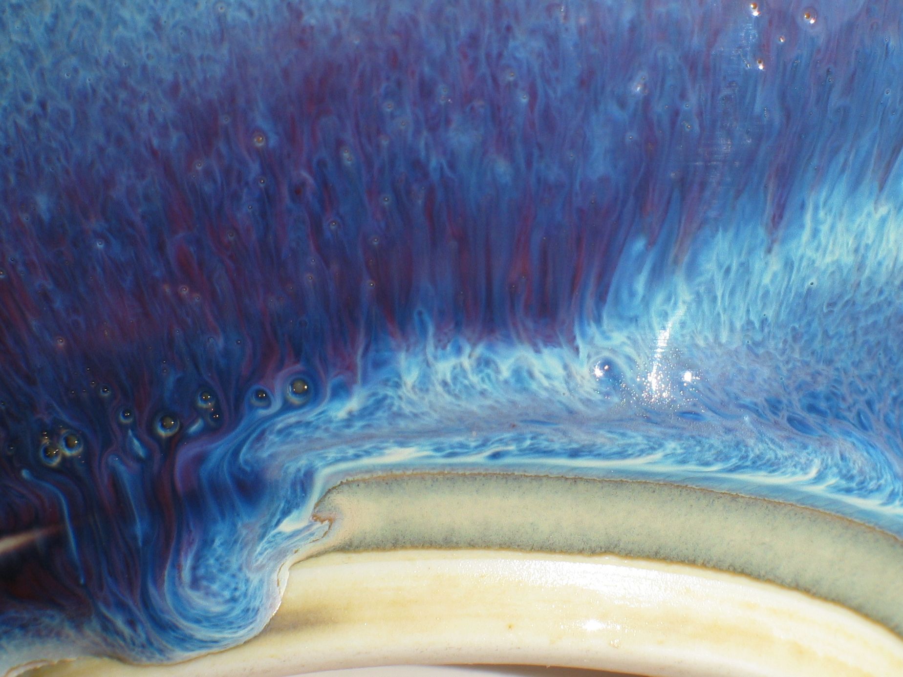
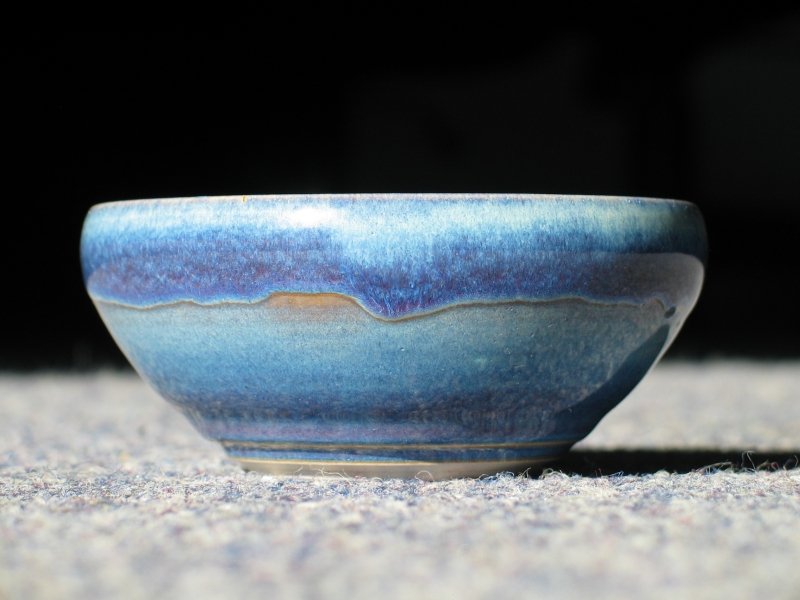
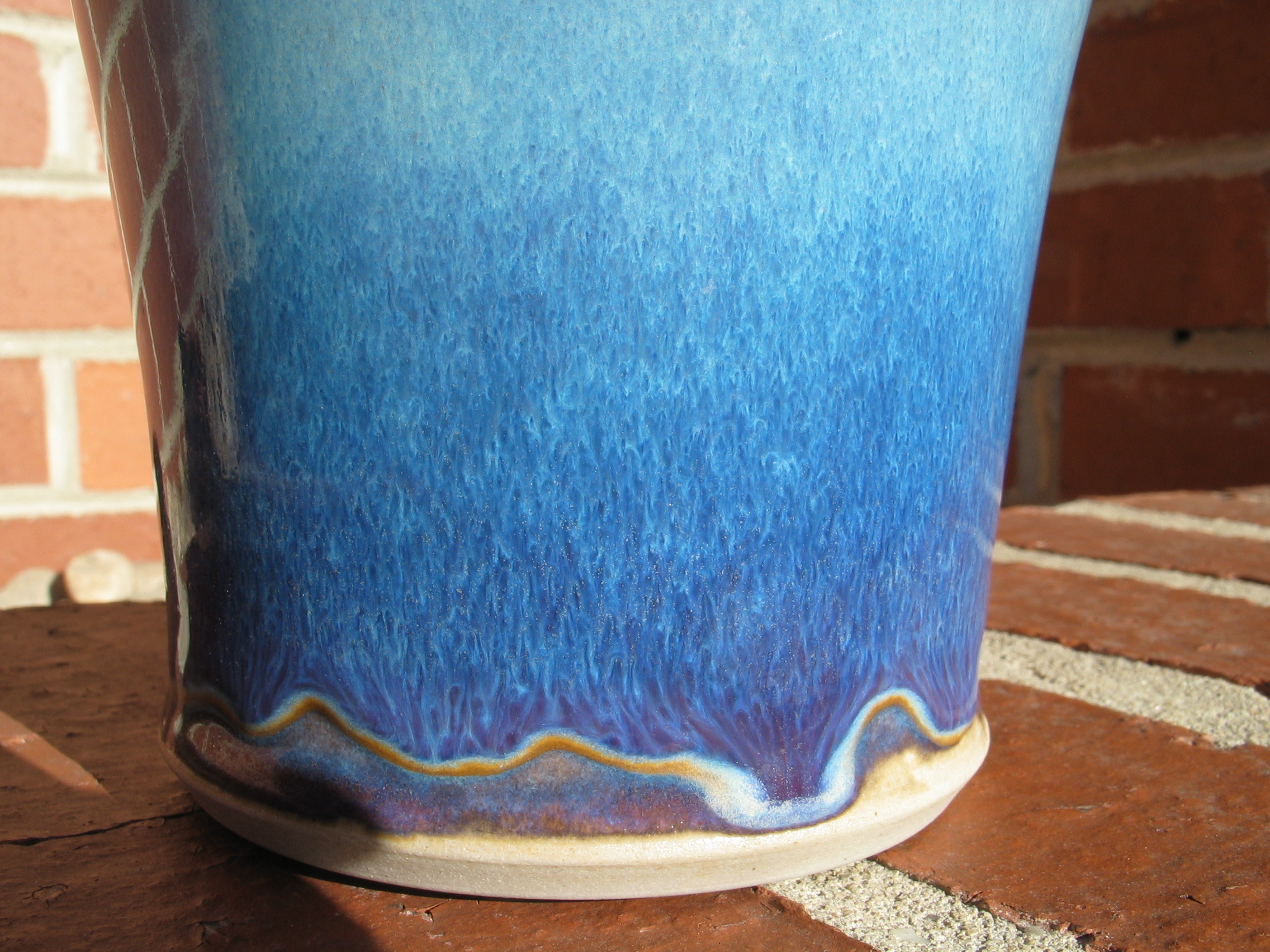
Vase, detail of side.
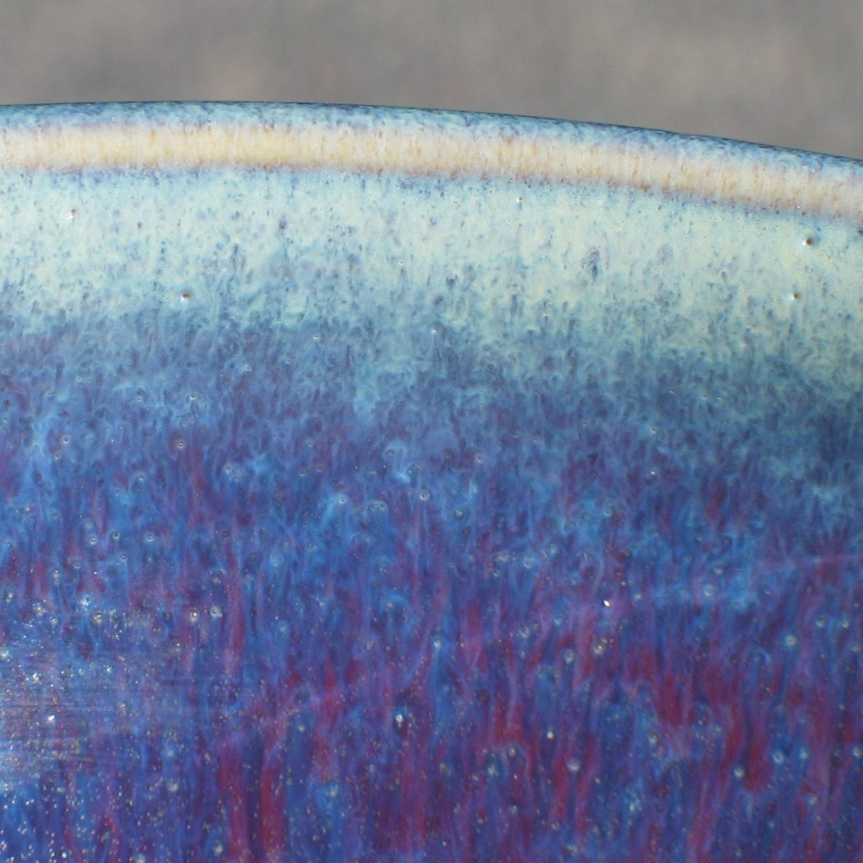
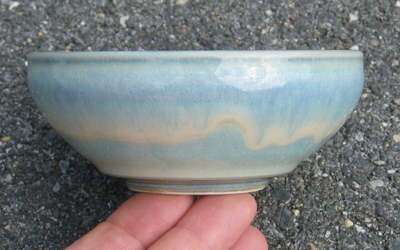
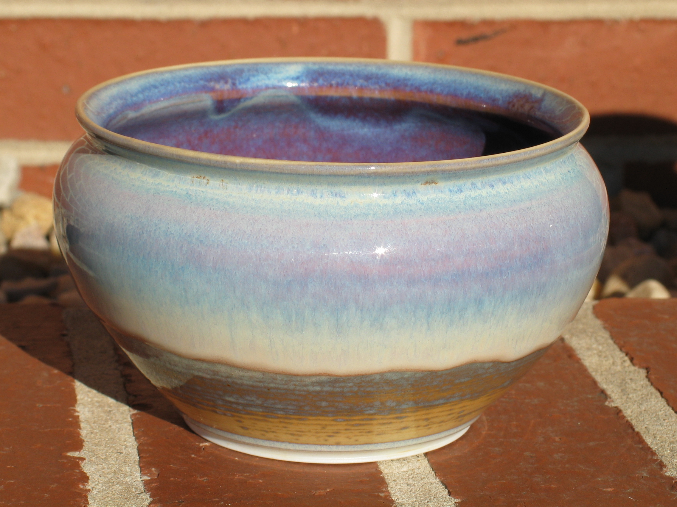
Outside of the bowl.
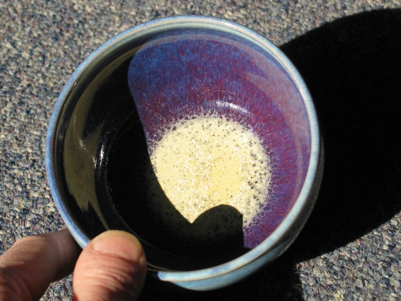
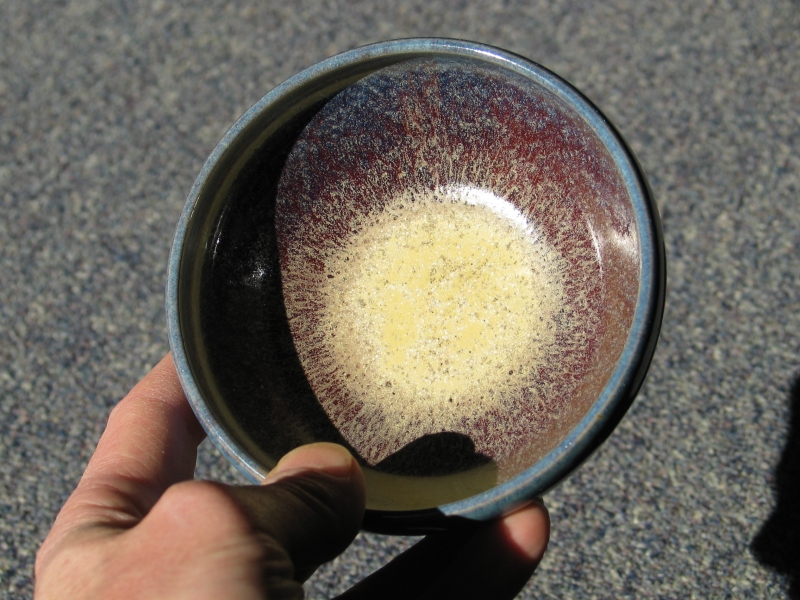
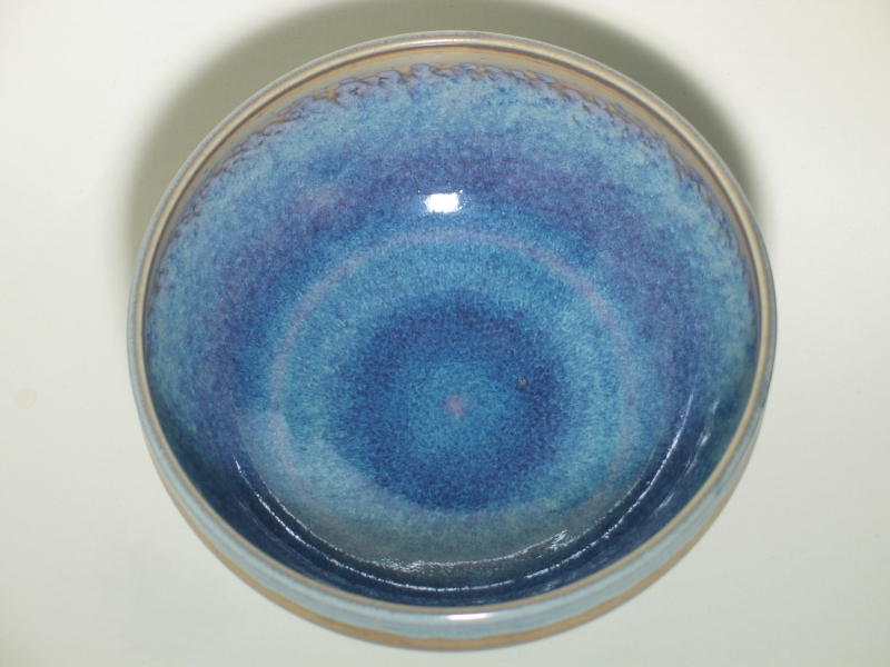
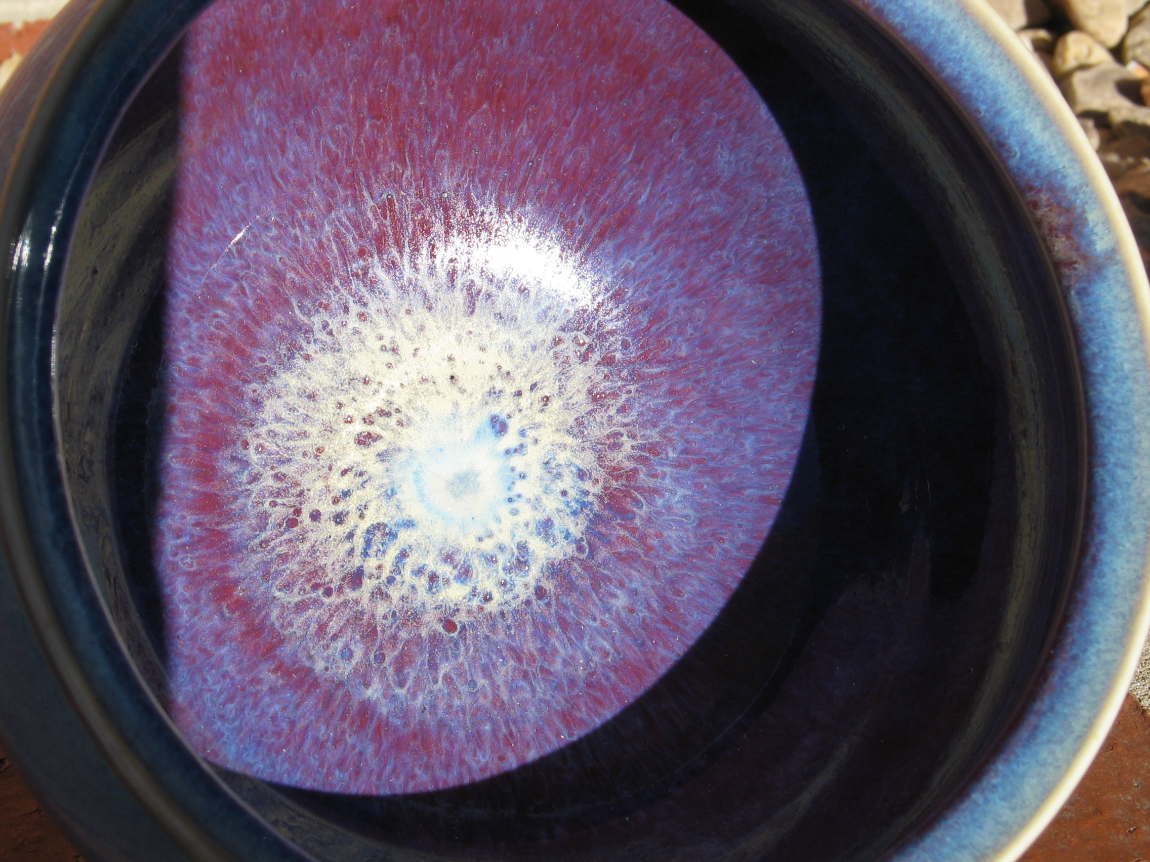
Inside of the bowl.
February:
(Mid-February)
Onward to Modest Reproducibility
The Joss Research Institute
19 Main St.
Laurel MD 20707-4303 USA
Contact Information: