(Private collection.)
Photos: Rick May.
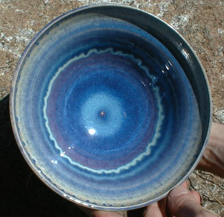
Here is a bowl that’s covered with a fairly early version of what I've been calling “Fake Opal Blue” because it is a re-engineered version (series of versions, actually) of a glaze that Larry Bruning came up with, which he calls “Opal Blue”. I have to spray the glaze on to get the rings; if I just dip the pieces into the glaze, they are much calmer.
I’ve been fussing with this glaze for over a year and a half now; it’s pretty decent (if a bit brash), but it’s not quite matched to the thermal expansion of the porcelain yet, so it crazes. I’m working on it.
(Note, added much later: It is November, 1999. I have whipped the thermal expansion issue for two common commercial throwing porcelains that are available in the Seattle area, one of which is the Miki Willis mix that I mention in the paragraph after the next note.
(Another note, added even later: It is November, 2001. I thought I had whipped the thermal expansion issue, but there were complications. I’m still working on this glaze family, and coming to a greater understanding of glazes in general. There is some information on this issue in my Web journal; but it is scattered, and may not be easy to locate.)
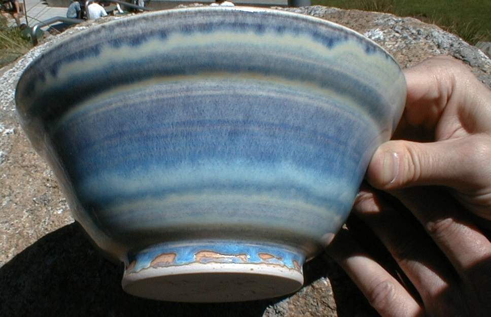
Because of the way the color is formed, this glaze gives me different colors on different kinds of porcelain. On some commercial throwing porcelain I get a range of colors that is somewhat redder, going from dark red-purple to a fairly gray color where the glaze is thin. I tend to prefer the richer blues and the strange gold it develops (just barely noticeable on the footring in the second picture, above) with the version from which I made the bowl up top. It gives about the same range on a blend that was developed by Miki Willis (a Seattle potter); I use her porcelain a lot, specifically for this reason.
(Note, added much later: unfortunately, the gold is something I don't seem to get when I adjust the thermal expansion correctly. Working on it...)
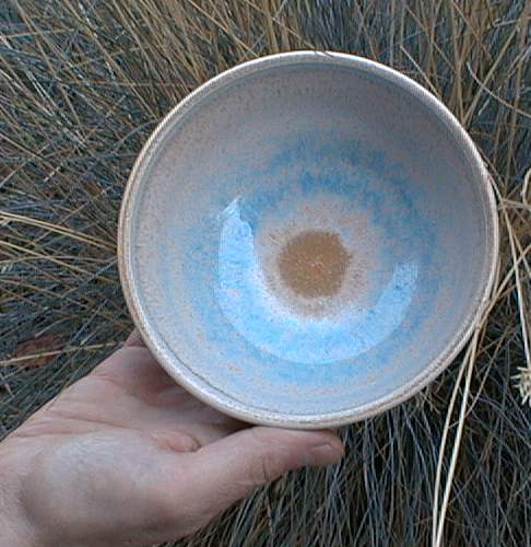
I also like the turquoise that you see here (next photo) on my own Georgia-kaolin-based mix. (The bowl belonged to my mom, but we gave it to the late Daphne Lewis-Lofton and her husband, Joseph Lofton, shortly before Daphne died. She was an amazing person, and the world is the less without her. R. I. P.)
The bowl is slightly underfired (hence the sandy look) but you can still see how different the color is in the ring around the center:
On the whiteware mixes I use, by the way, this glaze is so bland as to be boring. One other thing about it is that it looks rather different when I dip the pieces in it than it does when I spray it on; the photos here are all of sprayed objects. (See this page for a dipped example.)
Back to the second Pottery page
Pseudo-mail-to: a@b.c, in which you replace "b" with my first name followed by my last name (total 9 characters), "a" with just my first name (only 3 characters), and "c" with the usual 3-letter specifier for a noncommercial organization.
Special note: before I tweaked this page in 2013, the “Last modified” date was Thu Nov 15 00:11:04 PST 2001.
Last modified: Mon Oct 21 23:48:04 EDT 2013