(14 January and 04-06 March, 2001, with later continuations)
Soon after I got involved in pottery I discovered that
there were glazes I wanted to use on my pieces, but
didn’t find among the ones I had access to. I also
discovered that I didn’t really like most of the
ones that were available to me. No surprise, I
soon found myself trying to mix a few of my own. This
page is the story of one of them, a Temmoku variant that
I hoped would be a deep rich transparent cherry-mahogany
red in bright light, rather than the apparent black of
most Temmoku glazes.
The term “Tenmoku”, regrettably often spelled “Temmoku” these days, appears to be the Japanese version of Tian mu Shan, “Heaven’s Eye Mountain”, an area in China where tea is grown and teaware was (and perhaps still is) used by monks, but not apparently made. The major styles of teaware that are referred to by the term “Tenmoku” were manufactured in the Jian and Jizhou regions, and transported to many places in China.
Teabowls were brought to Japan, apparently by monks who had visited Tian mu Shan; they became famous, and some of the styles were eventually reproduced in Japan or transformed into Japanese styles. The most familiar of these, at least to us, are the ones with dark, iron-rich glazes; but there were various glazes in use in the two regions, and the name properly refers only to the pottery styles. For the purposes of this page, then, I will use the spelling “Temmoku” to refer to the glazes, both ancient and modern.
[Various books on Chinese and Japanese ceramics have more information, if you’re interested. (I particularly like Hare’s Fur, Tortoiseshell, and Partridge Feathers; Chinese Glazes, by Nigel Wood; and Inside Japanese Ceramics, by Richard L. Wilson.)]
There are a number of common variants, which I won’t get into here; they include oilspot glazes, hare’s-fur and possibly partridge-feather glazes, and (if I’m remembering correctly) teadust glazes, which appear to be dark glazes that haven’t been fired to full maturity.
I strongly suspect that the familiar “Kaki” (persimmon-colored) glazes and the so-called “Russet Ding” glaze are also closely related. This page is not particularly about those things, but I may discuss them elsewhere because I find them interesting.
Just by the bye, if you haven’t seen a kaki glaze
and you are only familiar with bright orange persimmons,
I should note the fact that many Japanese persimmons are
rich orangy brown inside, and that’s what the
glaze looks like. (...And if anyone spells it
“khaki”, that’s just wrong. Khaki is a
fabric color that has nothing whatever to do with
iron-rich glazes. The name derives from a word that
means “dust” or “dust-colored”.)
To return to the track:
I say apparent black because Robert Tichane relates, in his excellent book on Ash Glazes, that when he looked through a glaze chip from one of the ancient pieces he was surprised to find that it was actually yellowish. The ancient pieces were fired in oxidation, and the body was high in iron, so it fired out to a rather dark color. The combination appears black or extremely dark brown under most types of lighting. Our modern glazes are mostly fired in reduction, so the colors and effects are slightly different, but the glazes can be just as lovely.
For a fine example of a modern Temmoku glaze, have a look at Ron Roy’s work.
As you can see from Ron’s photos, a Temmoku glaze appears glossy and black where it is thick, and “breaks” to some pleasant opaque color, usually a milk-chocolate or peachy brown, on edges and ridges.
This page is actually largely about my being somewhat slow on the uptake, as will become apparent.
I like a number of the variants of Temmoku, and in fact I’ve managed to copy one or two of them since I wrote most of this page; but in particular I wanted something red. Not knowing whether there were any Red Temmoku glazes, as I hadn’t seen any (not to give a whole lot away, I still haven’t, other than my own, and I’ve never seen a photo of one in a book, though I have seen some tomato-orange things that were described as “red”), and not having the least notion of how to create such a glaze, I set out to make one anyway. This is perhaps not a formally approved way to proceed, but we will leave that aside for the moment.
For ingredients, I chose the wonderful brick clay that I have, and fireplace ash (unwashed) from Cynbe Ru Taren’s fireplace (I was house-sitting for him at the time).
These alone quickly proved insufficient. I did get some nice opaque browns as I started with plain clay and began adding ash; some of them even had tiny reddish crystals in them, which I found attractive and encouraging... they are pleasant glazes, similar to some of the Tanba glazes of Japan or to Kaki, and I’m happy to use them; but they aren’t Temmoku, much less Red Temmoku. When I eventually added too much ash I got a stringy transparent greenish glaze that looked rather like many other typical ash glazes. So far, so good: I wasn’t where I wanted to be, but I was getting good information about the behavior of my materials.
At that point I decided to increase the clay content a bit and add some silica and some red iron oxide, because Temmoku glazes are high in iron and because I figured that some silica might smooth the surface a bit. I also figured that the clay should prevent the legginess that was caused by the ash.
This, however, is where I made a crucial error: I weighed the clay and the ash after running them through a 10-mesh sieve. Then I mixed up the glaze by adding the silica and iron oxide and water. The resulting glaze slip was full of huge chunks of obnoxious crap, and when I ran it through a 60-mesh sieve to get rid of those, I lost an uncertain amount of each material. Once that happened, I no longer had any least notion what the real proportions were.
Oops.
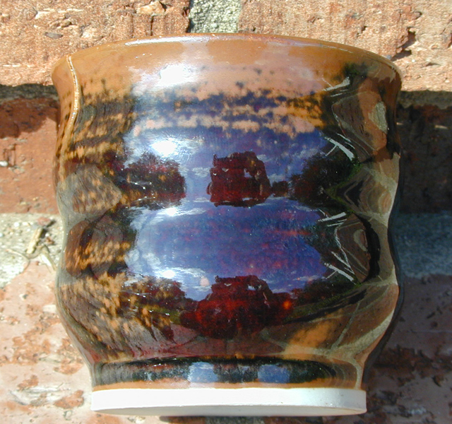
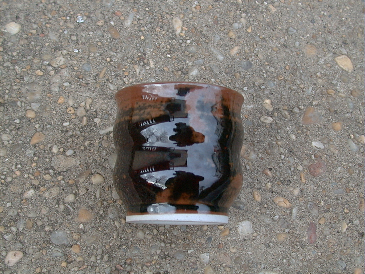
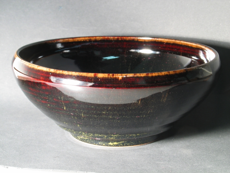
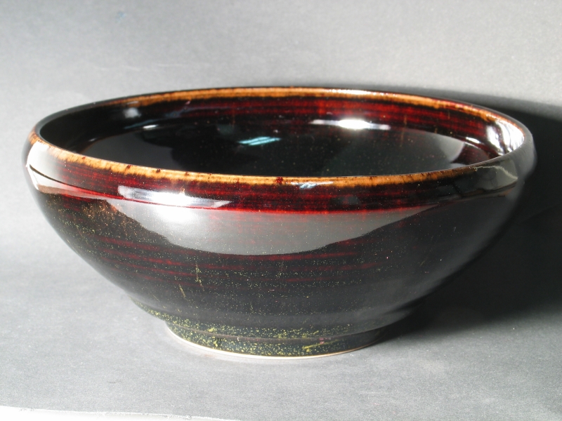
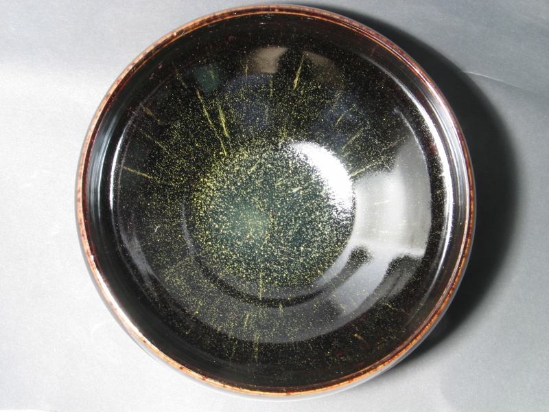
Double oops: almost needless to say, the glaze was a Red Temmoku, just what I wanted. I’d even managed to make enough to dip a few pieces. It looked about like these images:
One of the characters I notice in this glaze is a pronounced glossiness. I’m not really sure whether the other pieces are quite so shiny, but the example shown here certainly is. I have not, btw, made any attempt to color-correct either photo.
Needless to say, when I tried to replenish that batch by adding to it, I lost the redness. That was in July of 1999, and I’ve been trying ever since to figure out how to get back to that glaze. Sigh...
[[Note, added much later: I did, in fact, get the red
glaze back, briefly, a few years later. See
this page
for photos of a bowl I made with it. As of 2010 I am
continuing to look into this,
and maybe getting somewhat more insight into it, though
it becomes clear that the effect is not trivial to
achieve. I have fired lots and lots of brown glaze tests.]]
Here (after a few paragraphs of explanation) is a photo of a test tile, covered with a glaze I made in the late summer or early autumn of 1999, when I was first trying to figure out what had gone wrong. This particular glaze, and several others I made then, use a synthetic equivalent of wood ash. It turns out that the composition of actual wood ash is so variable that it’s almost pointless even to have it analyzed, because the next batch is likely to be considerably different. Ashes from different parts of a single tree, in fact, can be surprisingly unlike one another. (I never did get that original batch of Cynbe’s fireplace ash analyzed, and it is just barely possible that there was something special in it that was responsible for the lovely red color. I sincerely hope not... but I know approximately what he was burning, and it does offer some solace: about the only way to get a uniform ash is to pick one brand of pressed wax-and-sawdust “logs” and burn only those. He didn’t quite do that, but it was close, so if there’s something special in those logs, I can get it.)
To return to this test, when I compared it with others in the series I concluded that it contained too much silica. After you’ve looked at a couple dozen test tiles from the bizarro planet, you begin to discern certain things about this family of glazes. Let me list them:
You’ll notice that nothing in the list makes it red. We aren’t quite there yet, though I will get back to this later. Meanwhile, here’s the picture:
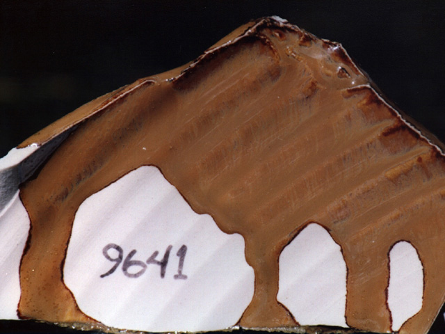
I really like this glaze, because it reminds me of melting coffee ice cream. I can’t use it, of course, because it runs like water. Oh, well...
“9641” equates to 45% Slip Clay, 30% Synthetic Wood Ash, 20% Silica, and 5% Red Iron Oxide. Now, I have thought all along that I remembered my original recipe (using the incorrect weights I mentioned above) being as follows:
I probably should have tried to look this up in my journal, but I didn’t. (...Or maybe I did, and failed to find it. My journal is a rambling stream of incontinent logorrhea, with only occasional markers. I think maybe I need to teach myself to use Boswell, which would have made it trivially easy to find this or anything else in there; but it would take me a very long time to get the entire journal typed in — I have years of it, and it’s all handwritten.)
As I say, when I first made 9641 and the related tests it was clear that the blond appearance was caused by a relatively high silica content. Why I didn’t act upon this promptly, I’m not entirely sure. Instead I tried various things, none of which worked. (You can see one of them on the Journal page about the brick clay, which I link to above.)
After I got to Laurel I went through lots more iterations, many of which contained peculiar yellowish and greenish crystals, and are interesting in their own right. Here are a couple examples (I won’t bore you with more than two, though if you’ve gotten this far and you find this stuff boring, well, maybe you should switch to a different page?):
NOTE: As of late 2014, I am unable to find the next four photos. This is rather distressing. I will continue to search when the opportunity presents itself, and if I can locate copies of the files I will restore them.
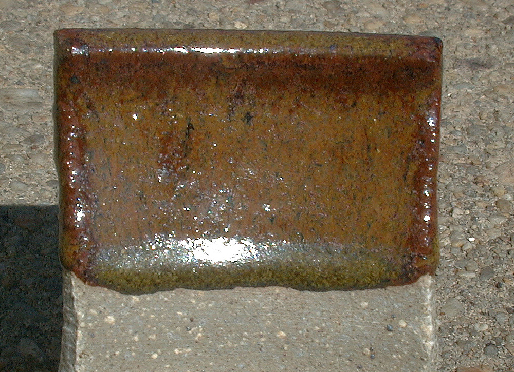
The first of these is on stoneware, the second a different formulation on porcelain. The peculiar crystals are most easily seen at the bottom. If you look closely, you’ll notice that the glaze on the stoneware has a reddish look about it, just below the rim. I found that both frustrating and encouraging. The one on porcelain breaks to a nice opaque brown on edges and ridges, and is dark brown where thick. It’s almost a regular temmoku, except for the crystals. In fact, I actually used this version as a hare’s-fur glaze.
Again, somewhere during my testing, I got another glaze that was fairly close. It didn’t have huge numbers of the weird crystals, and it broke almost reasonably to a milk-chocolate brown at the top of the tile. It was brown rather than red, however, and it ran very badly:
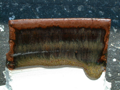
After committing all of these more-or-less-interesting tests that told me some of what I needed to know but not all, I finally made a stab at guessing what I’d lost while running the slip through the sieve. I had refrained from trying this earlier because it seemed impossible, but after protracted testing didn’t get me where I wanted to go, I decided that I had very little to lose. Here’s the first result:
(If you care, that’s 44% clay, 32% ash, 19.5% silica, and 4.5% iron oxide.) The oddest thing about this test, I think, is the fact that instead of being clear and breaking to opaque, it’s opaque and breaks to clear. So go figure. I have, btw, made a slight color correction to this photo, as it was originally a bit too pink.
It was when I saw this tile come out of the kiln that I finally came to my senses, at least partway, and decided to swap the amounts of silica and iron oxide, even though I knew that this would give me an iron-saturated glaze. I also fired the first tests of the swapped formulas (I did two of them) in an electric kiln, in an oxidizing atmosphere, whereas all the other tests have been fired in a gas kiln in a reducing atmosphere. (When I wrote that, I had another pair of test tiles, waiting to go into the gas kiln at Glen Echo Park, which is where I was taking classes at the time. You’ll see them in a paragraph or two.)
In retrospect, the results were expectable. I’ve had this effect occur in other glazes, as far back as 1996 or 1997. (It’s the bottom of the glaze drip in the last photo on my first set of pottery photos .) Not only that, but you’ll note the absence of the yellow and green crystals, which I take as an indication that I’m on the right track.
I’m sorry the sparkles don’t show up well in the photo;
you really have to move the piece around to catch the
reflections off the flitters (that’s apparently what the
little crystals inside the glaze are called, at least by some
people).
There are lots of aventurine glazes, but most of them
have red or golden flitters in them, and the majority
are fired at lower temperatures. I like this glaze, and
I intend to continue working with it (I’ve wanted it
since I saw that first glaze drip, in fact); but it
isn’t temmoku, so that report will be on the aventurine
page.
My bet is that when I get the other test tiles back from the gas kiln they will look very much like the ones that are on the aventurine page now, only runnier. For one thing, the gas kiln fires hotter. For another, iron is more of a flux when it’s in reduction. The obvious thing to do about this is to reduce the iron content, and that is what I’m about to try: for the next set, I’ve cut it in half. (That makes a glaze with 92 parts rather than 100, but it’s easy enough to rectify the recipe and turn it back into percent. I may also try bringing up the clay and ash while holding the silica constant and cutting the iron oxide in half, which results in a slightly different balance.) I’ll report results as they appear.
(19 March, 2001)
Sure enough, I went down to Glen Echo today for the kiln opening, and found some expectable things waiting for me. First, here’s a photo of the more likely candidate:
These ran, and they’re dry, but where they are thick, they get dark (well, except down at the bottom, where they have the expectable yellow crystal stuff). It’s clear, though, that I’m still somewhat off track.
For fun, I also tested the iron-saturate glaze that works as a black aventurine in my electric kiln. It came out like this:
This one also runs. That isn’t exactly unexpected: iron is a lot more of a flux in reduction than it is in oxidation, and we’re two full cones hotter in any case. (This was a "cone 11 hard down" firing, typical for Glen Echo’s gas kiln.)
(19 March, 2001)
Having seen these, I decided to look back over my results once again. When I did that, two glazes stood out. They are the two that I mention on this page just after I reach Laurel, one of which is shown on both stoneware and either porcelain or an ungrogged white stoneware called "B-Mix", which is probably closer to most commercial throwing porcelains than it is to most stonewares. (These are the second and third photos after the "9641" image. The stoneware result, which is the first photo after 9641, puzzles me, and I’m reserving judgement on it for a while.)
Working from the formulas for those, and comparing them to a few others, I came up with something that should be a notch closer to what I’m looking for. I’ll be testing it in the next firing down at Glen Echo. Then I made a spreadsheet with a variorum listing of temmoku glazes from other sources, to compare mine against. While it’s true that other temmokus are not what I’m looking for, they are at least interesting.
One or two large differences I see: first, they all seem to have almost the same amount of calcium as iron. Second, they all have a lot more alumina in them than mine. This is somewhat puzzling, because I have managed to make a glaze that works. Perhaps the extra magnesia I have in my relevant formulas is partly making up for the lack of alumina — magnesia seems to stiffen the melted glaze. My glazes seem to run around 2%, while the average of the 8 glazes I checked was 1/2%.
I’m working up a version of my glaze that is about as
close as I can get to the average of the others, using a
bit of kaolin to bring up the amount of alumina and some
whiting to balance the calcium level. I’ll be testing
that along with my current best guess. Again, I’ll
report results as they appear.
(10 October, 2004)
A certain amount of time has passed since I wrote about this topic, but it has not strayed too far from my mind, and I finally have some real progress to report.
In the process of reading the Nigel Wood book I mention above, I came upon another glaze I really wanted. This one is terribly rare, but it does exist, there are shards, and he publishes an analysis. It only took me about two years to get from there to a working glaze. (Long story, which I discussed in the December, 2004 issue of The Studio Potter.)
This glaze, like the ancient Tenmoku glazes, was fired in oxidation. You may imagine my surprise when I found the occasional bit of red coloration in the most recent batch of my version (most of the color is orange, but you can almost tell, from this next photo, that there is a hint of red a bit below the sharp edge at the shoulder of the piece):
There’s no brick clay or wood ash in this glaze, which eliminated two more of the possible sources of the magic. Hey, at least the search narrows a bit.
In actual point of fact, it narrows even further: I used partly high-purity Red Iron Oxide in that particular glaze batch, and partly some RIO that I had left from my days in Seattle. It seemed like that batch was the only one that made significant amounts of redness...
...and I was about to go to Seattle in August. While I was there I talked with the folks at Bruning Pottery, where I’d done the original work. Sure enough, the RIO that I’d used, back in 1997, was 84% pure. I bought 25 lbs of it at Seattle Pottery Supply, brought it back with me, and started using it in further testing.
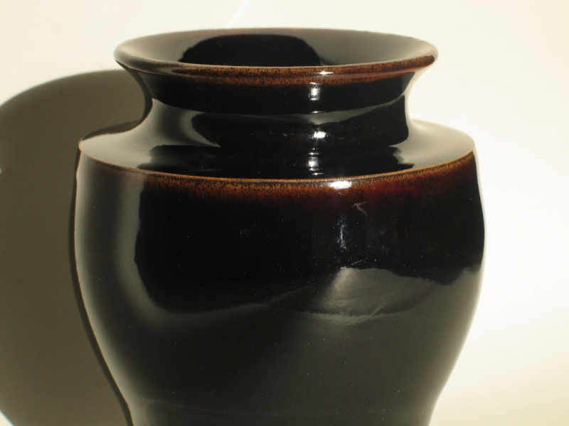
For various reasons I returned to the combination of Brick Clay and Wood Ash with extra RIO. Having made lots of tests in the interim, I opted for about 73% Brick Clay, 21.5% Wood Ash, and 5.5% RIO. (Those numbers are approximate, but they’re close.) After a bit of fiddling and sieving (fortunately nothing as gross as what I had to do back in Seattle), I am now, once again, getting substantially what I want. These photos cannot really do this glaze justice, but they’ll give you at least some sense of it. Here is a bowl I took out of the kiln this afternoon:
I don’t know how wide a temperature range is possible for
this color, but my initial experience is that cone 11.5 is
within it, and current experience extends that downward:
this bowl was fired to cone 10, in reduction; the little
vase, above, was fired to cone 9, in oxidation.
This entire wretched exercise brings up the issue of "The Sweet Spot", which I hope to discuss in an article that I’ve begun to write. The sweet spot for Red Temmoku is fairly narrow, which is a good part of why it has taken me so long to get back to it. You have to have the right amount of Iron in your glaze, it apparently has to have the right impurities in it (though I have yet to test this), and you have to have the right amounts of other things in the glaze as well — if I put too much Wood Ash into this glaze, for example, I get a nice rich brown.
To be sure, when I started this I had only the beginning
of an understanding of glaze chemistry. It is now some
seven years later, and I’ve been working on glazes
essentially throughout the intervening time, so my
understanding is at least a bit more thorough now, and
that helps. I should also note that Scott Scidmore
suggested, some months ago, that impurities in the RIO
might be responsible for the effect. It now appears that
there’s a good chance he’s right about that, and I think
I’m going to get an analysis from the manufacturer if I
can. (If not, I will grit my teeth and pay a lab to do one
— just because I can make a Red Temmoku glaze today
doesn’t mean I’m finished investigating. What happens if I
can no longer get the magic RIO? I’m hosed unless I know
how it works.)
To a slightly outdated Overview of the glazes I’m interested in or working on.
Email: a@b.com, where you can replace a with my first name (jon, only 3 letters, no “h”) and b with joss.
Phone: +1 240 604 4495.
Last modified: Wed May 10 12:00:42 EDT 2017


